SIHU GOUYE
Make life more refreshing
-
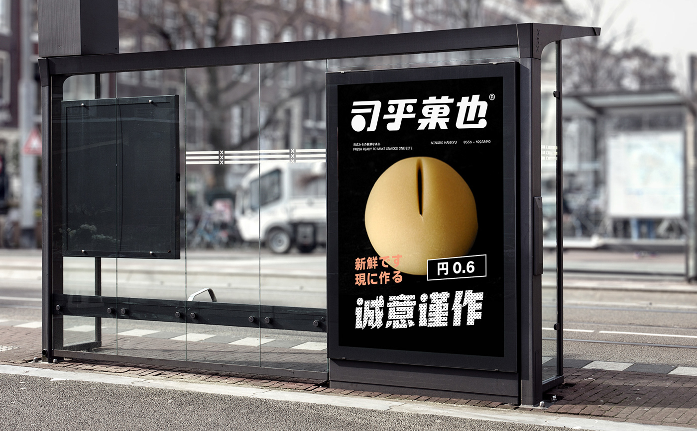
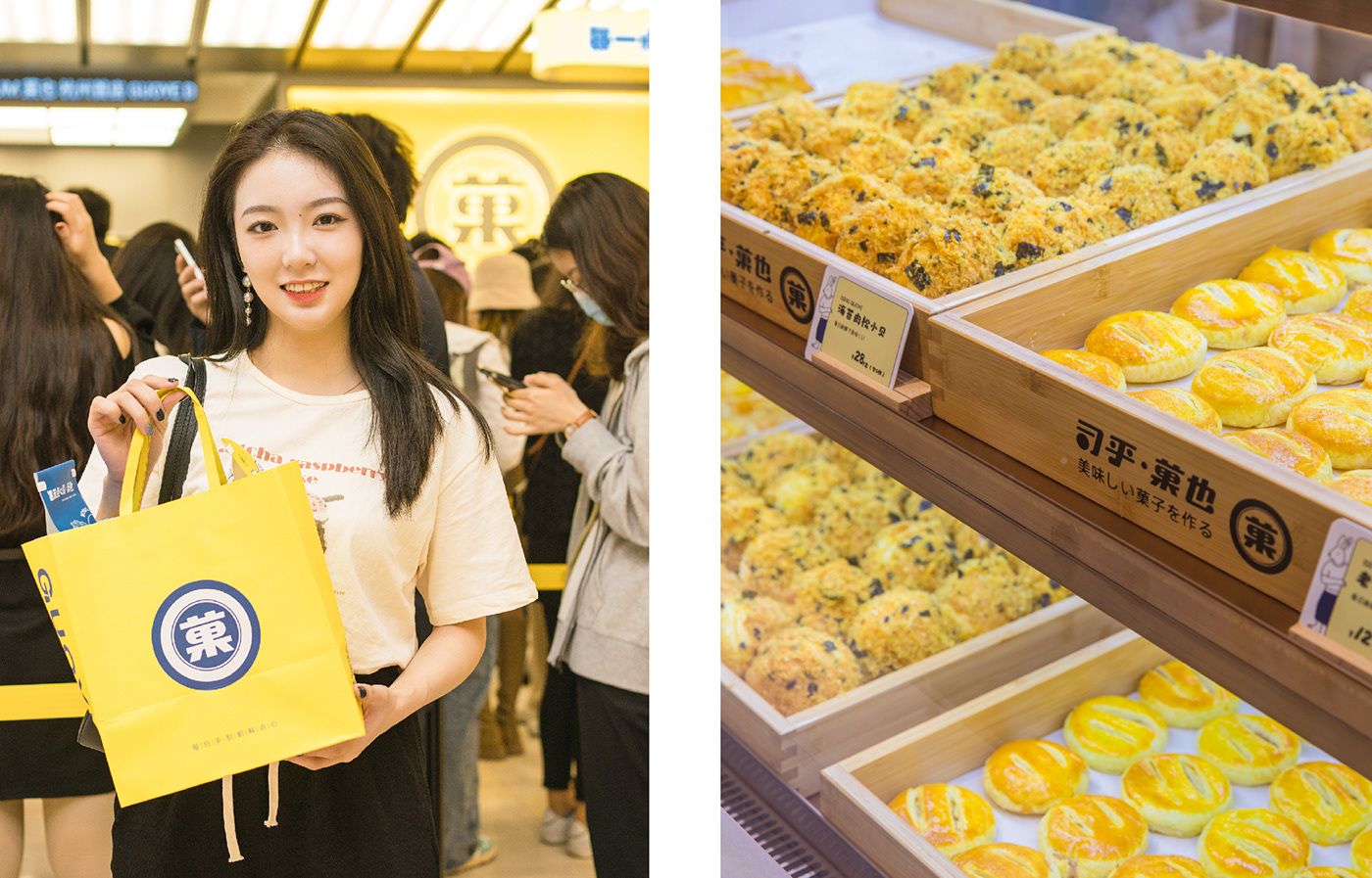
GOUYE is a Japanese hand-made dim sum brand under SIHU. Facing the current life situation flooded by "fast",GUOYE looked for another possible life, and gave it some special sense of ritual-enjoying hand-made snacks slowly in the urban forest, and savoring the seasonal beauty in dim sum. Ingenuity and enjoyment are the values that Guoye pursues.
Make life more refreshing
-
GOUYE is a Japanese hand-made dim sum brand under SIHU. Facing the current life situation flooded by "fast",GUOYE looked for another possible life, and gave it some special sense of ritual-enjoying hand-made snacks slowly in the urban forest, and savoring the seasonal beauty in dim sum. Ingenuity and enjoyment are the values that Guoye pursues.
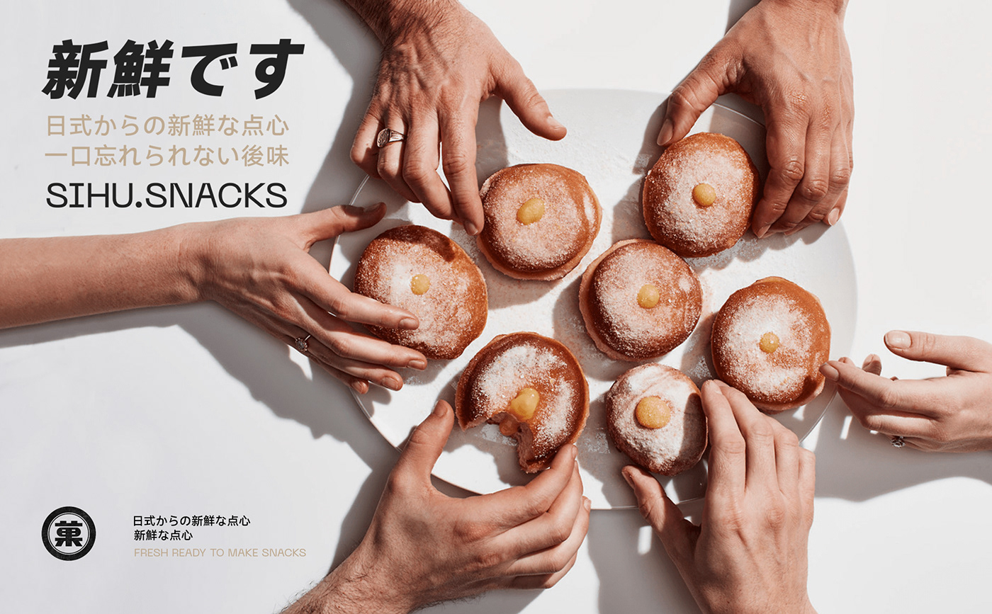
司乎·菓也
让生活多点心鲜
-
司乎·菓也是司乎旗下的日式手作点心品牌。面对被“快”充斥着的生活现状,司乎·菓也寻找的是另一种可能的生活,并赋予其一些特别的仪式感——在都市森林中慢享手作点心,品味点心里的时令美好。匠心与享受,就是司乎·菓也所追求的价值观。
让生活多点心鲜
-
司乎·菓也是司乎旗下的日式手作点心品牌。面对被“快”充斥着的生活现状,司乎·菓也寻找的是另一种可能的生活,并赋予其一些特别的仪式感——在都市森林中慢享手作点心,品味点心里的时令美好。匠心与享受,就是司乎·菓也所追求的价值观。


Dim sum or font
Every bit, attentive
-
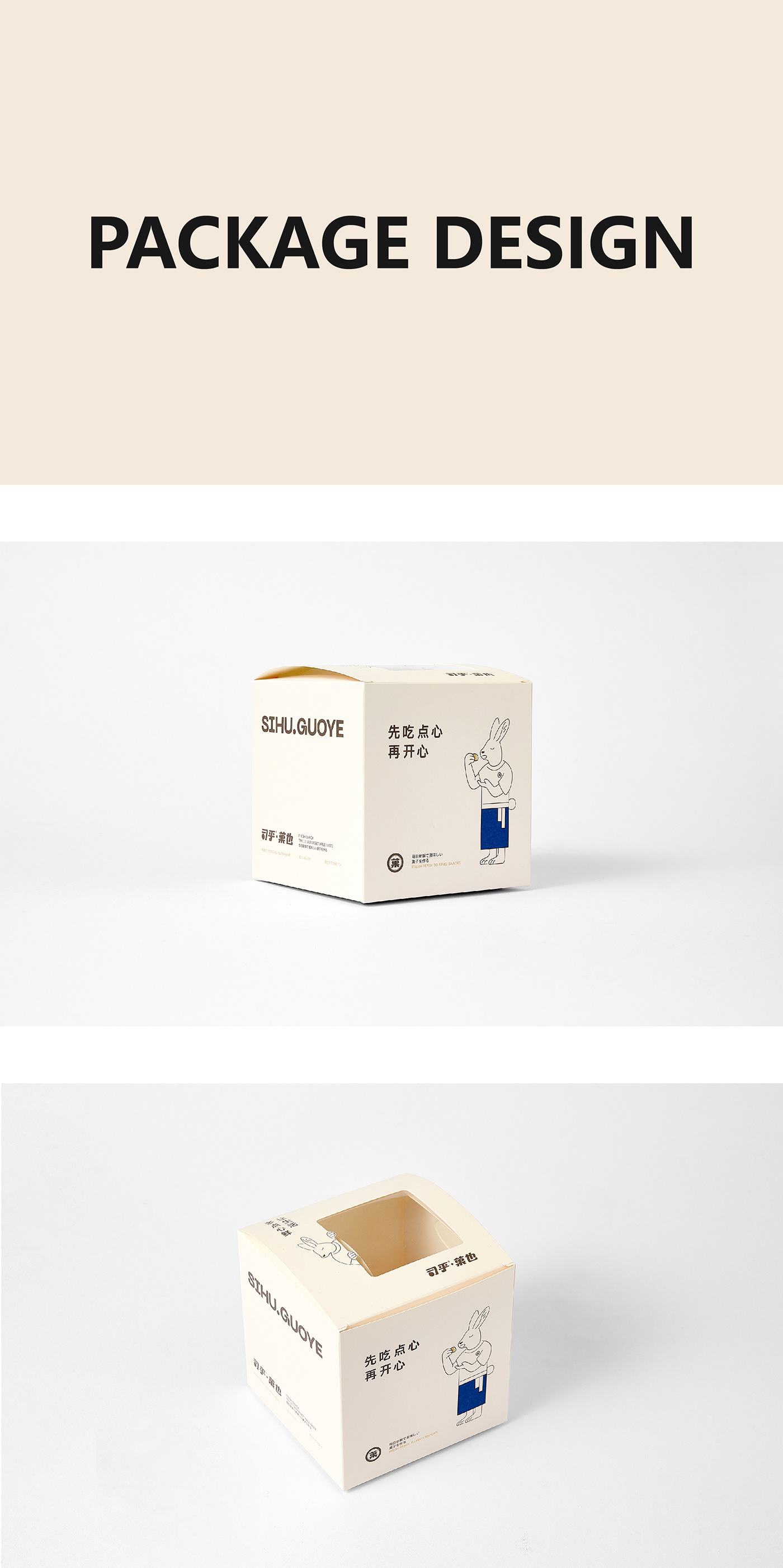
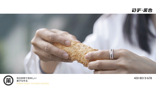
We design the logo according to the product characteristics of GUOYE. The main product of GUOYE is Japanese dim sum, with ingenious selection of materials and freshly made, each with the temperature of hand-made and the best wishes from the pastry chef. What is the biggest feature of Japanese dim sum? Mostly round. Therefore, we take "dot" as "•", which is not only a form of the product, but also represents the spirit of craftsmanship. We incorporate it into the font to make the logo more stylistic, thereby showing GUOYE Brand character: round and friendly.
Every bit, attentive
-
We design the logo according to the product characteristics of GUOYE. The main product of GUOYE is Japanese dim sum, with ingenious selection of materials and freshly made, each with the temperature of hand-made and the best wishes from the pastry chef. What is the biggest feature of Japanese dim sum? Mostly round. Therefore, we take "dot" as "•", which is not only a form of the product, but also represents the spirit of craftsmanship. We incorporate it into the font to make the logo more stylistic, thereby showing GUOYE Brand character: round and friendly.
点心 or 字体
每一点·都用心
-
我们根据司乎·菓也的产品特性设计对应的标识,菓也主打的是日式点心,匠心选材、新鲜现做,每一款都带有手作的温度以及点心师的美好祝愿,而日式点心最大的特征是什么?大多是圆形的。因此,我们取“点”为“•”,既是产品的⼀种形态,也代表着用心的⼯匠精神,并将其融入字体中,使标识更具风格特征,从而展现司乎·菓也的品牌性格:圆润、亲和。
每一点·都用心
-
我们根据司乎·菓也的产品特性设计对应的标识,菓也主打的是日式点心,匠心选材、新鲜现做,每一款都带有手作的温度以及点心师的美好祝愿,而日式点心最大的特征是什么?大多是圆形的。因此,我们取“点”为“•”,既是产品的⼀种形态,也代表着用心的⼯匠精神,并将其融入字体中,使标识更具风格特征,从而展现司乎·菓也的品牌性格:圆润、亲和。

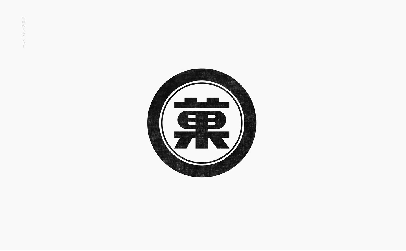
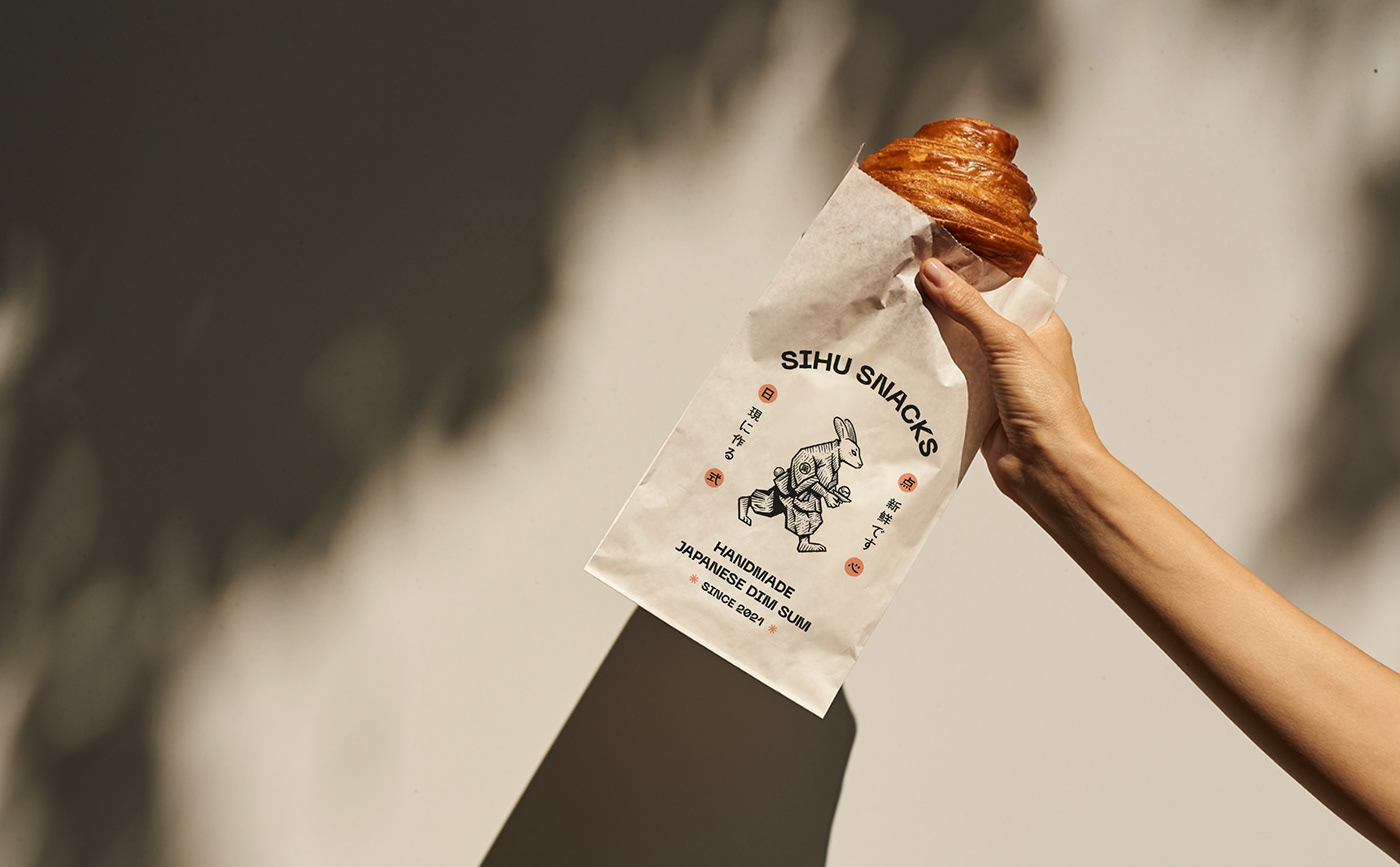
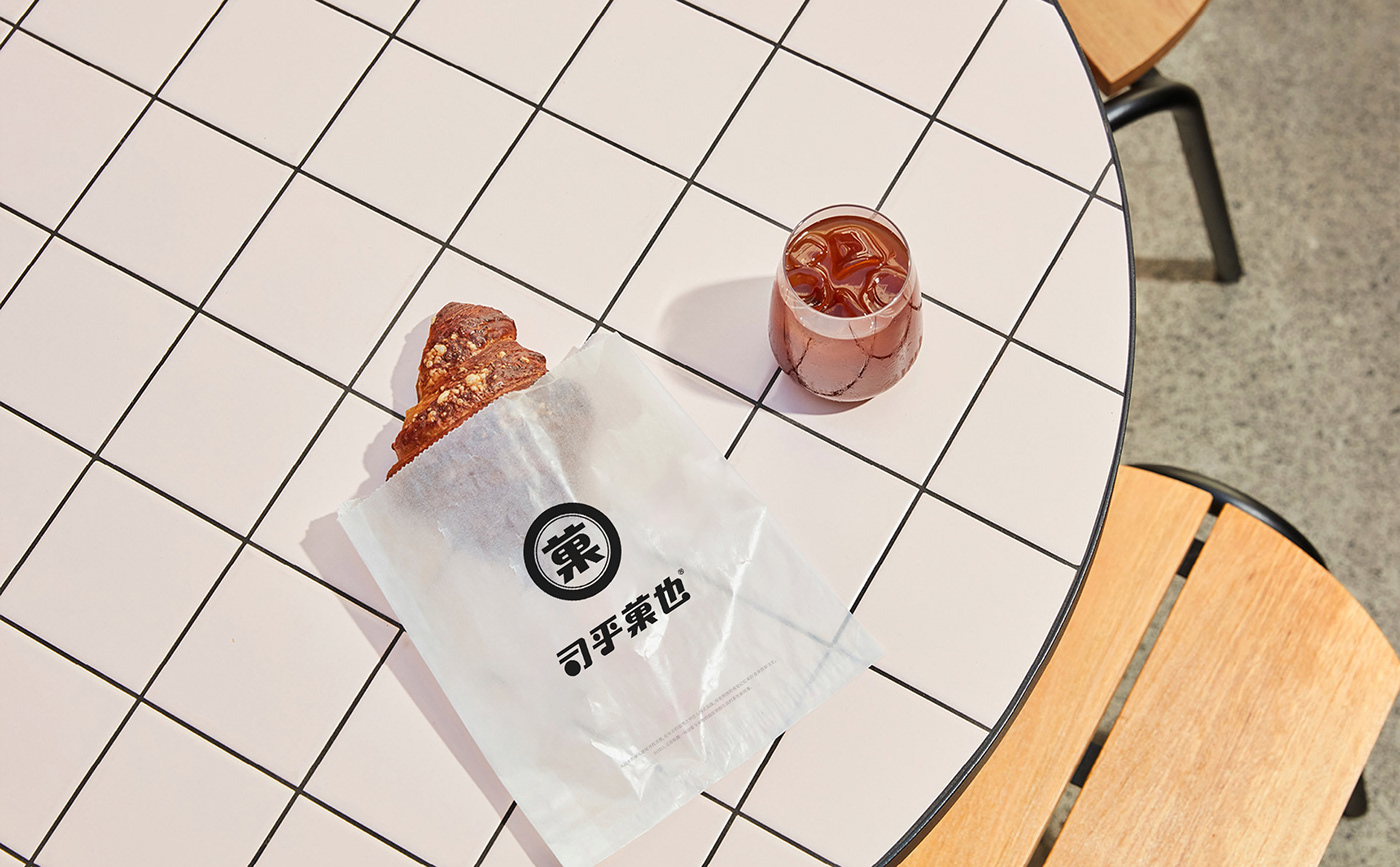
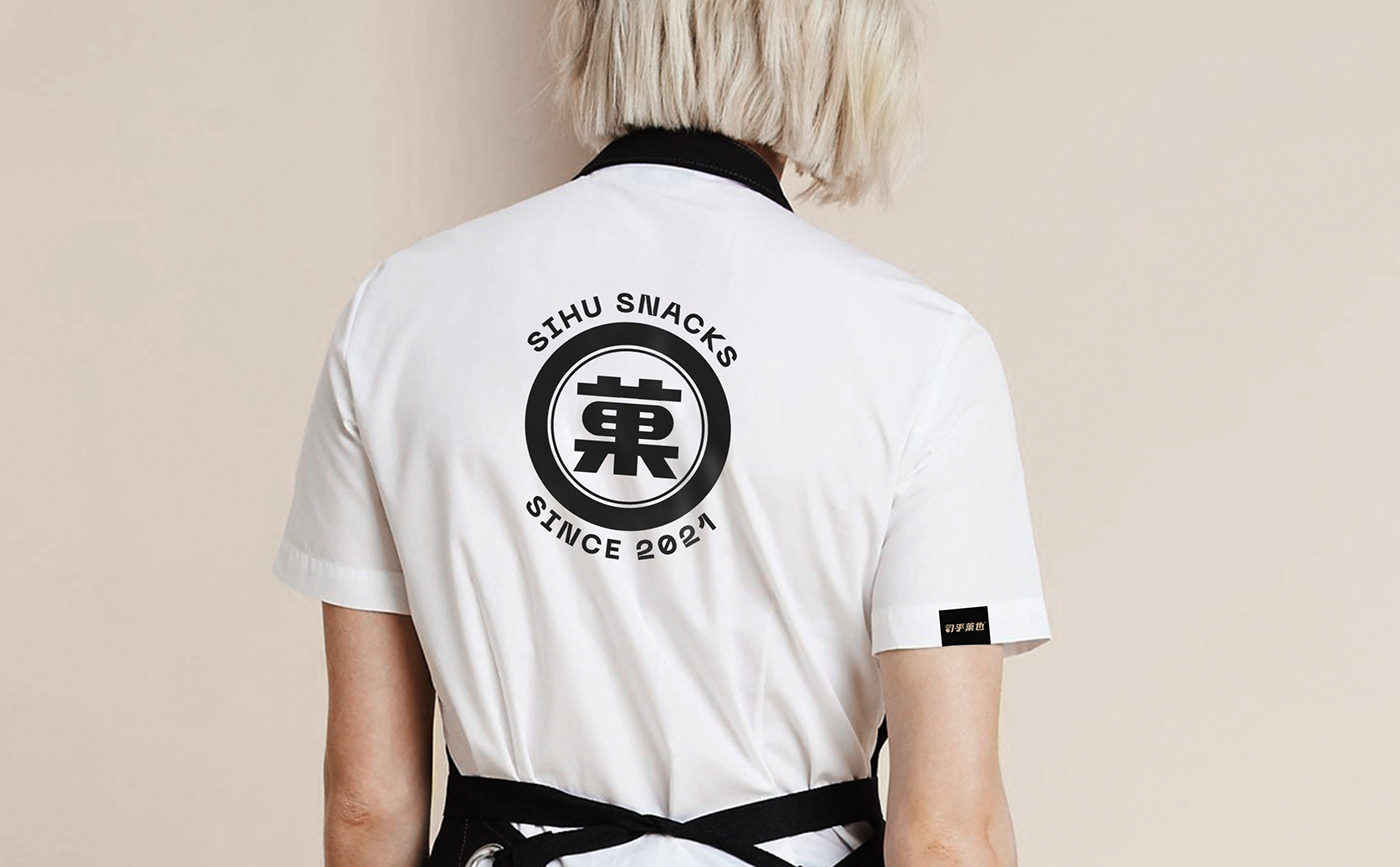
Category symbol: "菓"
-
In addition to the font logo design, we have also refined "菓" as a category symbol. "菓"-text: convey category differentiation; frame: convey a strong Japanese style. Fonts and symbols don't affect each other, can be used separately, can be applied to more usage scenarios, and enhance the outward output of the brand.
品类符号:“菓”
-
除了字体标识设计,我们还提炼了“菓” 作为品类符号呈现,“菓”——文字:传达品类差异化;外框:传达浓郁的日式风格。字体与符号,二者互不影响,可拆分使用,能适用于更多使用场景,增强了品牌的向外输出力。
-
除了字体标识设计,我们还提炼了“菓” 作为品类符号呈现,“菓”——文字:传达品类差异化;外框:传达浓郁的日式风格。字体与符号,二者互不影响,可拆分使用,能适用于更多使用场景,增强了品牌的向外输出力。
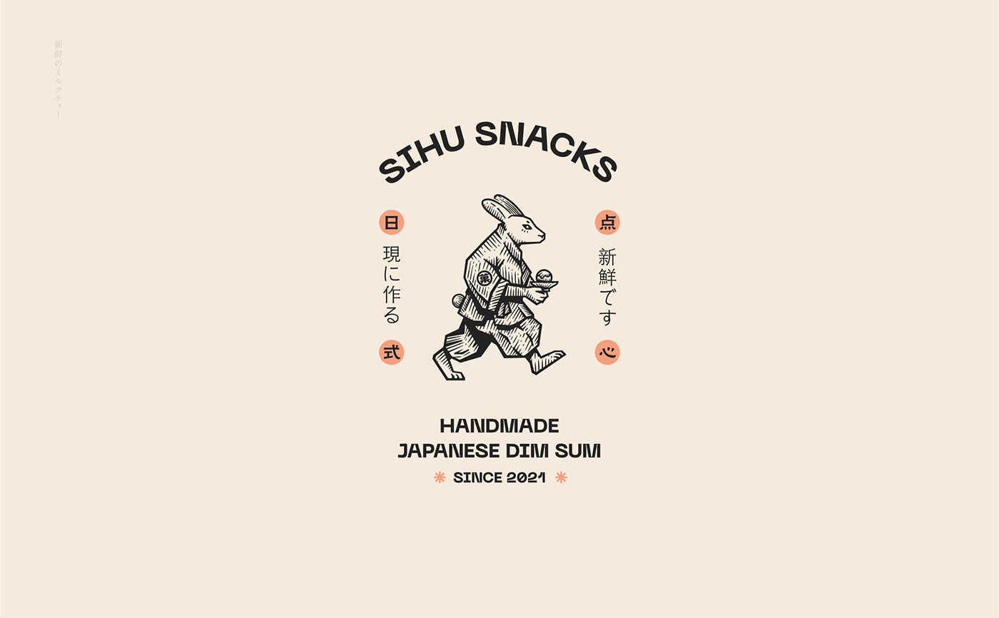
Create a differentiated brand image
Handcraft, ingenuity, beauty
-
We hope that the Japanese image that represents GUOYE will not be homogenized, such as deer, daruma, and bear, but should have a certain degree of differentiation, and be related to Japan, but not easy to be affected by other brands. What we found, "Rabbit" just met these points. Moreover, "rabbit" is a beautiful word in Japan and China. It is not only one of the people's zodiac signs, but also closely related to people's good hopes. Based on the shape of the rabbit, we anthropomorphized it and used the drawing method of prints to create a hand-crafted and ingenious visual image, emphasizing the brand's character and sense of handcraft!
塑造差异化品牌形象
手工、匠心、美好
-
我们希望代表司乎·菓也的日式形象不是被同质化的,例如:鹿、达摩、熊,而是应该具备一定的差异化,又和日本有关联、但不容易被别的品牌所发现的,“兔”恰好满足这几点。并且,“兔”在日本、中国都是一个美好的字眼,既是人的生肖之一,也与人们的美好希望密切相连。基于兔子外形,我们将其拟人化,采用版画的绘画方式,塑造出了一个手工、匠心的视觉形象,强调品牌性格与手工感!
手工、匠心、美好
-
我们希望代表司乎·菓也的日式形象不是被同质化的,例如:鹿、达摩、熊,而是应该具备一定的差异化,又和日本有关联、但不容易被别的品牌所发现的,“兔”恰好满足这几点。并且,“兔”在日本、中国都是一个美好的字眼,既是人的生肖之一,也与人们的美好希望密切相连。基于兔子外形,我们将其拟人化,采用版画的绘画方式,塑造出了一个手工、匠心的视觉形象,强调品牌性格与手工感!